01 · Overview
02 · Problem
03 · Concept
04 · Design Process
- Visual Hierarchy — Clear typography and structured layouts guide users naturally through the content.
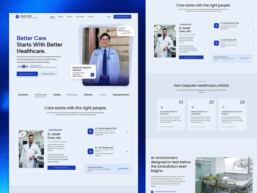
- Editorial Layout — Magazine-inspired composition creates a distinctive and engaging healthcare experience.
- Typography — Refined type choices establish personality while maintaining readability across different content levels.
- Spacing & Rhythm — Generous whitespace creates clarity and prevents information from feeling overwhelming.
- Accessibility — Content structure, contrast, and readable typography were considered to make information easier to consume.
- Human-Centered Design — Every section was designed around how users discover, scan, and understand healthcare information.
05 · Final Design
- A calm and refined healthcare visual language
- Editorial-inspired page composition
- Strong typographic hierarchy
- Generous whitespace and balanced layouts
- Clear content organization
- Warm, approachable visual styling
- A responsive and user-focused interface